
Inspirational Quotes with React 3D Effect

· 4 min read
Phill Dellow
Jargonator Extrodenarie
Go to DentralisedNZ
Issuing and Verification of EntraId VerifiedID Credentials on Azure B2C

In this post, I'm excited to showcase a modern React component that combines some of the coolest features of React and CSS to create a 3D parallax card. Each time you hover, the card dynamically changes colors and fetches a new quote from an external API when clicked.

This component demonstrates:

  • 3D Parallax Effect: The card tilts based on mouse movement.
  • Dynamic Backgrounds: A new gradient background on each hover.
  • Real-Time Quote Fetching: Random quotes to keep you inspired.

Check it out below!

"Loading inspiration..."

-

Click to refresh inspiration ✨

How It Works

This component uses advanced React techniques like useState and useEffect to interact with the DOM, fetching data from an API and applying dynamic CSS styles to give a smooth user experience.

Click the card for a new dose of inspiration!

So lets just jump straight into the React components code to see how we've put this one together.

First we import a couple of things

import React, { useState, useEffect } from 'react';
import './MindBlowingCard.css';

Yes we will have a look at that .css in a minute but back at the component we are

const MindBlowingCard: React.FC = () => {
const [quote, setQuote] = useState<string>('Loading inspiration...');
const [author, setAuthor] = useState<string>('');
const [gradient, setGradient] = useState<string>('');

// Fetch a new quote on initial render
useEffect(() => {
fetchQuote();
}, []);

const fetchQuote = async () => {
try {
const response = await fetch('https://api.api-ninjas.com/v1/quotes?category=happiness', {
headers: {
'X-Api-Key': 'thisismyrealfreeapikey.fromtheapi-nijas' // Replace with your actual API key
}
});
const data = await response.json();
const quoteData = data[0]; // Access the first item in the array
setQuote(quoteData.quote);
setAuthor(quoteData.author);
} catch {
setQuote('Believe in the of you!');
setAuthor('Unknown');
}
};

Youcan see in the first few lines we set up some variables then the code goes away to call this 'fetchQuote' method.

'fetchQuote' is an async calling off to our family friendly and free quote provider at the api-ninjas, recieving back a JSON with the quote and authors details and gracefully handling any errors coming back by displaying a default cryptic quote.

Next we'll set up some colour for our cards styling

  const generateGradient = () => {
const colors = ['#FF6B6B', '#FFD93D', '#6BCB77', '#4D96FF', '#D14DFF'];
const color1 = colors[Math.floor(Math.random() * colors.length)];
const color2 = colors[Math.floor(Math.random() * colors.length)];
setGradient(`linear-gradient(135deg, ${color1}, ${color2})`);
};

So this is a bit of a dynamically generated variable that create contains a colour gradient from one colour to another. It takes five HEX colours (yeah it sounds like black magic I reckon) and, it randomly selects from two of these five colours. The two selected colors to create a CSS linear-gradient at a 135-degree angle.

By passing this gradient to the setGradient function, it updates the component’s background style dynamically.

Now with 3D

Lets bring those two things together in out last bit of code and add to the top of it some cool 3D effects

  return (
<div
className="mind-blowing-card"
onMouseMove={(e) => {
const card = e.currentTarget;
const { width, height, left, top } = card.getBoundingClientRect();
const x = ((e.clientX - left) / width - 0.5) * 60; // Calculate tilt based on mouse position
const y = ((e.clientY - top) / height - 0.5) * -60;
card.style.transform = `rotateY(${x}deg) rotateX(${y}deg)`;
}}
onMouseLeave={(e) => {
const card = e.currentTarget;
card.style.transform = 'rotateY(0) rotateX(0)';
generateGradient();
}}
style={{ background: gradient }}
onClick={fetchQuote}
>
<h2 className="quote">"{quote}"</h2>
<p className="author">- {author}</p>
<p className="click-text">Click to refresh inspiration ✨</p>
</div>
);

This starts off with a trigger of a MouseMove, then getBoundiingClientReact() is going to calculate the cards position and dimensions.

Based on the mouse position within the card, the x and y variables set the rotation degrees. This calculation tilts the card more as the cursor moves toward the edges.

Then card.style.transform applies a rotateY (horizontal tilt) and rotateX (vertical tilt) effect to create the 3D effect.

Terraform Cloud Pt.1

· 3 min read
Phill Dellow
Jargonator Extrodenarie
Go to DentralisedNZ
Issuing and Verification of EntraId VerifiedID Credentials on Azure B2C

Lets just jump right in with some messy red arrows!

After creating your acccount and or signing in at Terraform cloud you're going to see somthing like this: uneditited screen shot 
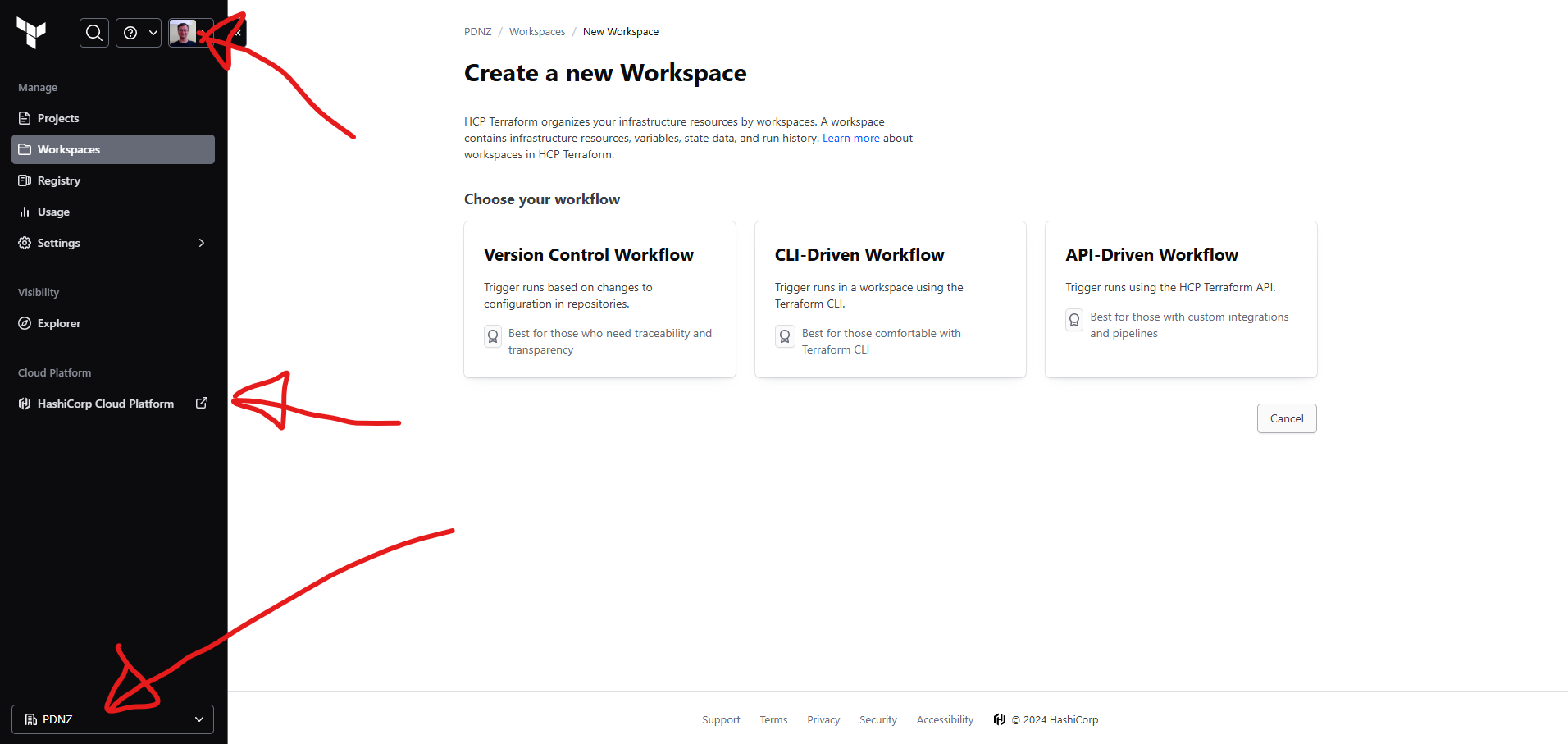
And after creating our first organisation (bottom arrow), we want to go ahead and create a new workspace for our work.

Getting Started

Worth noting that there are some great resources avalible through the Getting Started guide. uneditited screen shot

Terraform and HCP Terraform in a Nutshell

Terraform is an infrastructure as code (IaC) tool that lets you define and manage resources through configuration files, bringing consistency and automation to the infrastructure lifecycle. By managing services declaratively, Terraform reduces human error and allows you to automate infrastructure updates.

HCP Terraform enhances this by running Terraform in a secure, cloud-hosted environment. It provides benefits like state storage, integration with version control, and a private registry for sharing modules. Paid features include cost estimates, access controls, and policy enforcement, making it ideal for team collaboration on infrastructure projects.

TL-SAD

HCP Terraform Workflows Overview

In HCP Terraform, resources are managed within workspaces, each containing resource configurations, variables, and state files. HCP Terraform supports three key workflows:

CLI-driven Workflow:

Standard Terraform CLI commands trigger operations in HCP’s remote environment, adding security and visibility with minimal setup changes.

VCS-driven Workflow:

Integrates with version control to trigger Terraform runs on repository updates. Speculative plans for pull requests let teams preview changes, while merges initiate runs to apply updates.

API-driven Workflow:

Allows custom tooling to programmatically interact with HCP Terraform for dynamic infrastructure control.

Log in to HCP Terraform from the CLI

HCP-CLI

So we probably need to

choco install terraform

or at least

choco upgrade terraform

Then once thats set up we have to

terraform login

now that is going to take us off to a browser where we cut and paste that key from the browser into our orginal window:

CLI-login-to-browser

and it may not be raining money, but this is what sucess look like:

CLI-login-to-browser2

Variable Sets

HCP Terraform allows you to use workspace-specific or reusable variable sets for defining input and environment variables, standardizing configurations across workspaces. Variable sets streamline common configurations, like provider credentials, for efficient reuse and secure rotation. So in ADO it's a vartiable group, in Github actions they are secrets, but here in Terraform Cloud, they are variable sets.

CLI-login-to-browser2

First select the Organisation, then the settings on the right hand side and then 'variable sets'. Click on 'Create variable set'

variableset

This is where I'm going to not follow the instructions here anymore, because I don't want to set up AWS.

We are going to pop over to Azure, well PowerShell at least and run a couple of little commands:

az login

az ad sp create-for-rbac --role="Contributor" --scopes="/subscriptions/<subscription-id>"

This command will output the appId, password, and tenant, which correspond to the ARM_CLIENT_ID, ARM_CLIENT_SECRET, and ARM_TENANT_ID respectively.

Now my saved variable set looks like this and is ready to be used in a global context

variableset

React Journey: From Setup to Deployment

· 3 min read
Phill Dellow
Jargonator Extrodenarie
Go to DentralisedNZ
Issuing and Verification of EntraId VerifiedID Credentials on Azure B2C

In the past four days, I've embarked on a journey to modernize my website, incorporating React, TypeScript, and Docusaurus. This is the story of building philldellow.com, hosted on Vercel, to showcase not only my professional skills but also my personal growth as a developer. This blog post and the wider site is still actively being set-up so apologises for any rough edges as I learn it :)

Let’s dive into the process and the technologies that made it possible!

Setting Up the Project

Starting from scratch, I created a React project using TypeScript, bundled it into an ASP.NET Core project, and set up hosting on Vercel. Here’s the foundational setup:

Step 1: Create a React Project with TypeScript

npx create-react-app my-app --template typescript

Once the basic project was set up, I dived into creating a series of reusable components. Here’s a breakdown of some key components and how I used TypeScript to ensure they were robust and adaptable.

Creating a Reusable Button Component

<CodeBlock language="typescript">
{`import React from 'react';

interface ButtonProps {
label: string;
onClick: () => void;
style?: React.CSSProperties;
}

const Button: React.FC<ButtonProps> = ({ label, onClick, style }) => (
<button onClick={onClick} style={style} className="custom-button">
{label}
</button>
);

export default Button;
`}
</CodeBlock>

Styling and Layout with CSS and React

The Challenge of Responsive Design

To ensure the site looked sleek on both desktop and mobile, I created layout components using CSS modules and dynamic styling within React. Here’s a look at the responsive layout I implemented.

Building a Card Layout

To showcase project highlights, I used a responsive card layout with CSS modules.

import React from "react";
import styles from "./Card.module.css";

interface CardProps {
title: string;
description: string;
}

const Card: React.FC<CardProps> = ({ title, description }) => (
<div className={styles.card}>
<h3>{title}</h3>
<p>{description}</p>
</div>
);

export default Card;

Securing the App with Azure AD B2C Authentication

One key aspect of my project was adding authentication via Azure AD B2C. This enabled me to secure sensitive parts of the site, especially sections that manage verified credentials.

Setting Up Azure AD B2C

Setting up B2C authentication in my ASP.NET Core API required configuring both the server-side endpoints and the client-side authentication flows.

// Example of integrating Azure AD B2C authentication in ASP.NET Core
services.AddAuthentication(OpenIdConnectDefaults.AuthenticationScheme)
.AddMicrosoftIdentityWebApp(options =>
{
options.ClientId = "<YOUR CLIENT ID>";
options.TenantId = "<YOUR TENANT ID>";
});

Bespoke React Pizza stuff

· One min read
Phill Dellow
Jargonator Extrodenarie
Go to DentralisedNZ
Issuing and Verification of EntraId VerifiedID Credentials on Azure B2C

Congratulations, you have made it to the cooking photos! You could click on the DecentralisedNZ link above and learn all about VerifiedIDs via Decentralised validation of tokens against a blockchain, or you can scroll for some mid food photos.

uneditited screen shot insert a random uneditited screen shot from earlier

insert a random uneditited screen shot from earlier

Use this calculator to determine the hydration level of your bread dough.

Advanced Pizza Dough Calculator

Results:

Total Dough Weight: 1440.00 g

Flour Needed (Final Dough): 527.59 g

Water Needed (Final Dough): 312.41 g

Poolish Flour: 300.00 g

Poolish Water: 300.00 g

Salt Amount: 28.80 g

insert a random uneditited screen shot from earlier